Use Cases
Ensure every high-stakes deck is accurate, consistent, and client-ready.
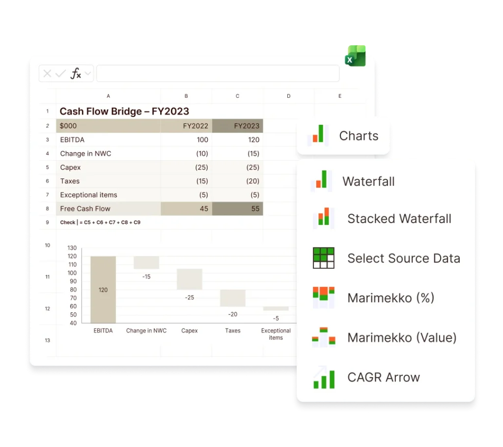
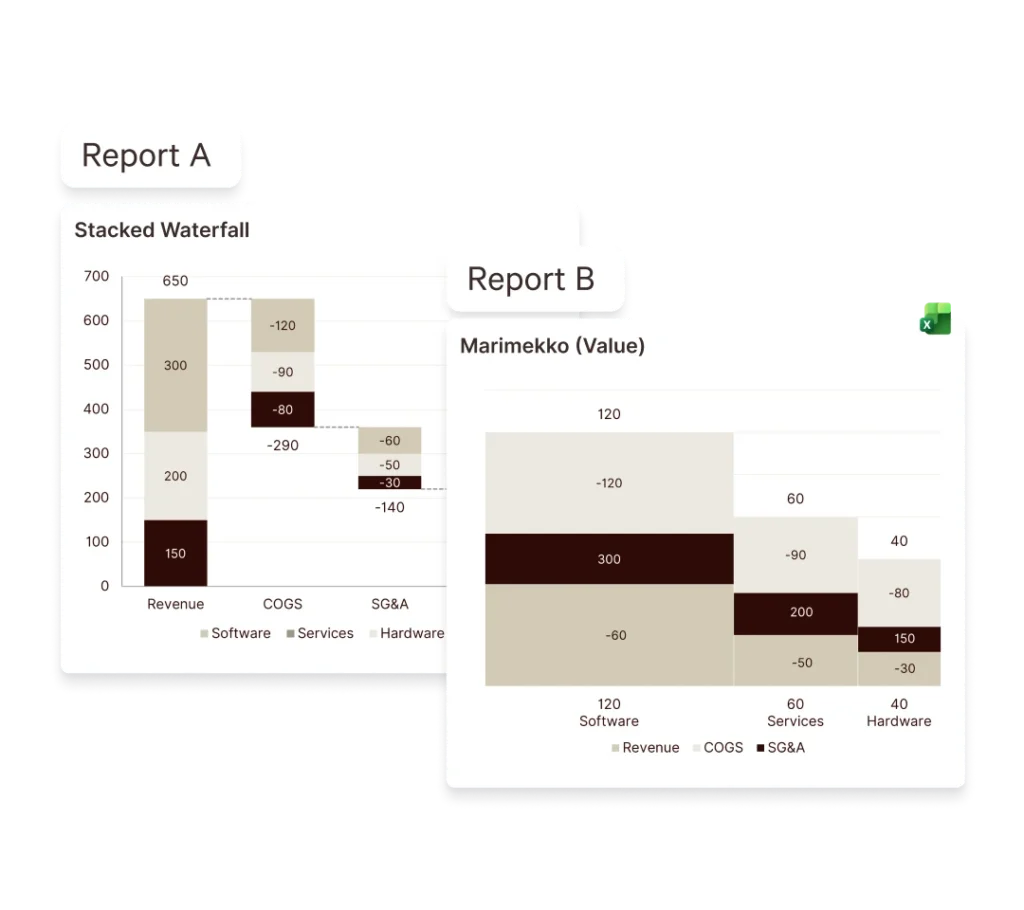
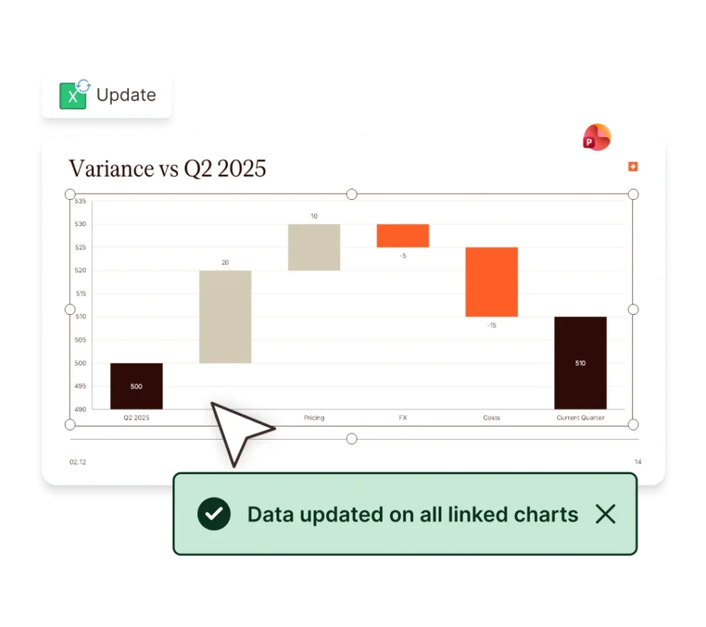
Build and audit models, create charts instantly, and update linked data, faster.
Prevent off-brand deliverables before they’re created and verify before sharing.
Ensure teams create on-brand, high-quality content – in Microsoft 365.
Industries
Win more mandates with faster, flawless due diligence, valuations and more.
Execute deals faster, manage portfolios efficiently and showcase your brand.
Deliver investment-grade materials that win and retain investors.
Prepare, update and review pitchbooks and IMs faster with built-in AI.
Teams
Standardize and automate pitchbook, IMs, and investor material creation.
No more brand policing. Empower teams to create consistent, on-brand content.
Take the scramble out of reporting with automated data, modeling, and AI reviews.
Secure, scalable enterprise AI for finance with fast, seamless rollout.
Webinar: Transforming Due Diligence Review with AI
Discover how UpSlide AI can boost consistency and confidence, and cut review times in half.
top features


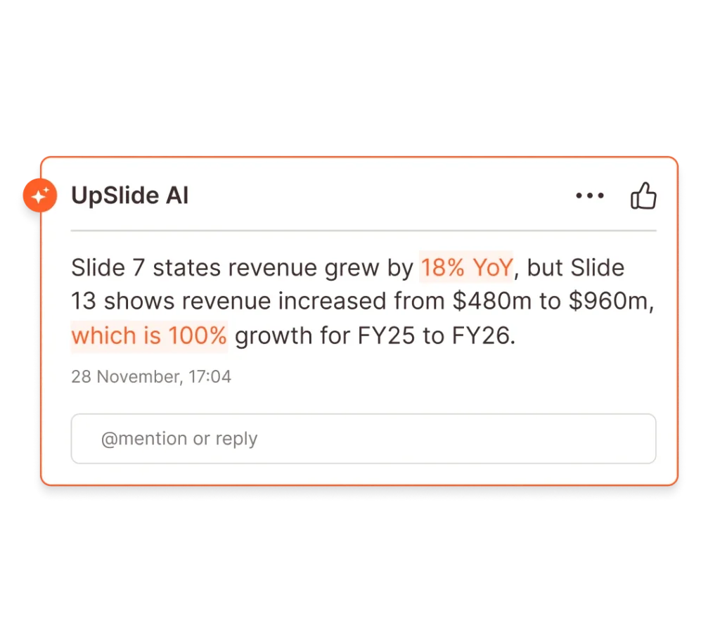
Airtight Reviews for Every Deck
Stress-test numbers and narrative with AI-powered review for complex finance deliverables.
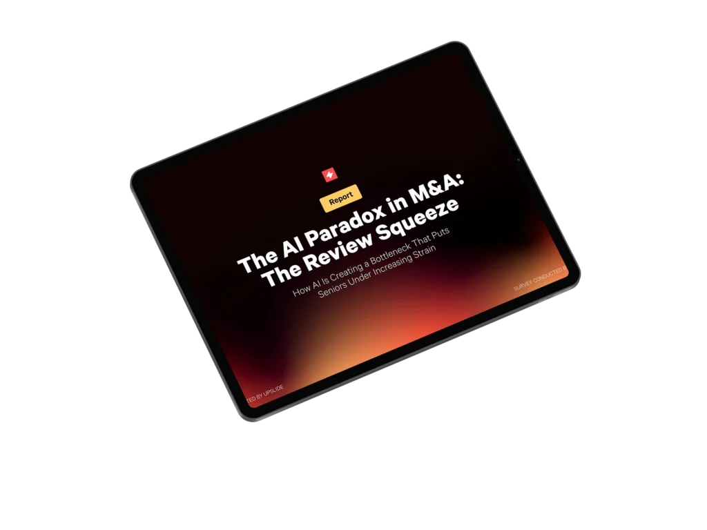
The AI Paradox in M&A: The Review Squeeze
Discover the surprising ways AI is increasing strain on some employees.
our company
There are 165+ UpSliders delivering excellent service to all our clients.
Get in touch and our team will be happy to answer all your questions.

From A to B Corp: UpSlide’s Mission for Positive Impact
Discover how we achieved our B Corp Certification.
Let’s Start Building Better
Documents Faster
Book a 15-minute consultation with an expert to discuss your needs and challenges before joining a personalized demo.

Thanks!
We’ll Be in Touch
We will organize a 15-min call with an expert to see what you need to build top-tier pitches and reports faster.
Then we will create a personalized demo of how UpSlide can solve your specific challenges.